The most common way for gathering creative ideas and making sense of them is to present them using a “mood board.”
Mood boards are used for a variety of industries, but they are used in particular in the creative industries as a way to express ideas and show different “moods” and concepts in a physical way. That is not to say that a mood board must be a physical item. It does not need to be.
Physical vs Digital
Pinterest is a fine example of a digital mood board in a broad scope of the word. There are a variety of different online resources that you can use for creating similar digital mood boards for a variety of different topics. Do not be afraid to experiment until you find the right one.
When it comes to projects, especially for sharing ideas with clients, I like to use Dropmark. It is a drag and drop or simple upload solution for a variety of file types. It also doubles as a file sharing platform when I need to share larger client files. The reason I like this resource, however, is that I can drag a variety of different ideas or conceptual things to the website area and they are all in one place under each project. These projects can then be shared with a variety of users as needed.
My latest mood board
My current mood board is one for gathering conceptual ideas more than gathering collective ideas. I want concepts to elaborate more on later. I just want to be able to go to the mood board when I sit down to actually design and see an over all concept and feeling I want to produce.
To do this, you can use a variety of programs or apps to create them. They do not have to be fancy. They can even be created using a piece of paper and pencil or poster board and clippings glued to it. There are a variety of ways to do it. Your creativity is the only limiting factor here.
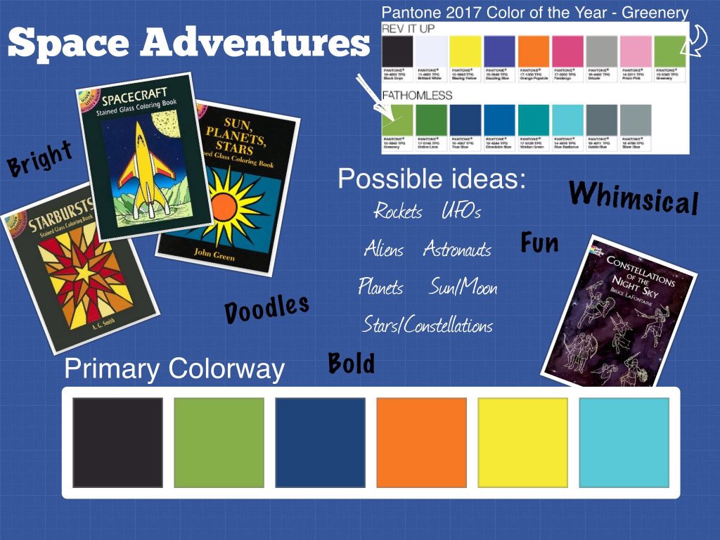
I used an iPad app called Moodboard Lite. I am trying a few out to see if I like how they layer and put things on their more traditional looking “digital” mood boards. I will say that I do like the capabilities of this app even with the limits of the “lite” version. I would be tempted to pay for the full version. My favorite feature is probably the ability to input the color palette and it actually look like a true color palette. The only thing lacking is the color codes. As you can see, I included those in the clip I pulled from the Pantone website.
Normally I would not use a blue grid, blueprint background for my mood boards. I am more of a white paper or cork board person, personally. However, the lite version of the app does not allow you to change the board background. I could live with that with the abilities for the other things. It does, however, make me want to know just how much more the full version can do.
This is a real concept mood board. I am considering these ideas for designs and colors for my next fabric line. The book covers were just place holders to give a quick glance at what type of designs I want – spacecraft, stars, constellations, moons, suns, starbursts, etc. You will notice that I accompanied the visual cues with a list of key words in two different formats – pictorial concepts and style concepts. The more information you give yourself, the more you have to work with when you sit down to physically design and to spark creative ideas as you go. These ideas can come from anywhere.
How do you use mood boards in your design work?
