I have touched on the topic of color before. It always comes down to color. I get asked again and again to pick something with blues and reds. If people only understood how many blues and reds there really are.
I have come to really hate the phrase, “I will know it when I see it.” If I hear that, I know that the person that spewed that nonsense has no idea what they are looking for, they are just hoping that you will inspire them to like something. The reality is that you could be shooting at a moving target in the dark, blindfolded. Tread very lightly and watch out for the landmines. They have already been triggered…
I touch back on this topic now, however, because I have discovered a couple of tools that could be helpful in picking and sharing colors. I thought I would share them with everyone. They are not fancy. They are not even big and spectacular. They are just tools. Unfortunately, a client and designer are still going to have to work together to get things to work together.
Coolors
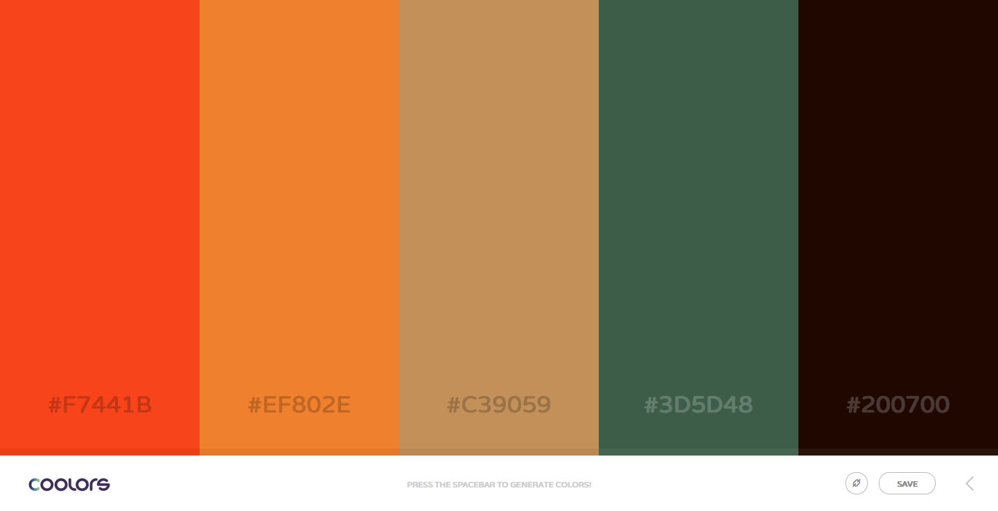
First and probably most basic of the two tools I found was Coolors. It touts itself as the “super fast color palettes generator.” I personally cannot attest to that, but it was pretty quick to come up with something.
It is easy to use. All you need is the spacebar on your computer and your eye. I tried it on my iPhone and it works on the mobile devices. No spacebar required there. That was a bonus. It states right on the bottom of the screen on the desktop version, “Press the spacebar to generate colors.” When you hit the spacebar, the colors on the screen change. You can hit the spacebar as many times as you want. It does not care.
Now I initially thought, “what was the point?” I first tried this on the mobile device. Then I clicked on one of the colors and it locked in place. Once you lock a color, it does not change. You can then hit the spacebar again as many times as you want and only the unlocked colors change.
There are five colors in each color scheme. If you need more than that, you will need to create multiple color schemes. The blocks of color on the screen are large. There is no guessing at the color, they are big and there for you to see. It is a nice change from the little boxes of colors of other color palette websites.
If you want to share your scheme/palette with friends, family, coworkers, clients, etc. it is as simple as sharing the link to the palette. Nothing hard about that. The above palette image is generated by this URL: http://coolors.co/f7441b-ef802e-c39059-3d5d48-200700.
You can save your palettes. That requires registration. This is free but it does require a confirmation code that is sent to your email. That takes a little while to receive so be patient. The website is fully functional without registering.
Adobe Colors
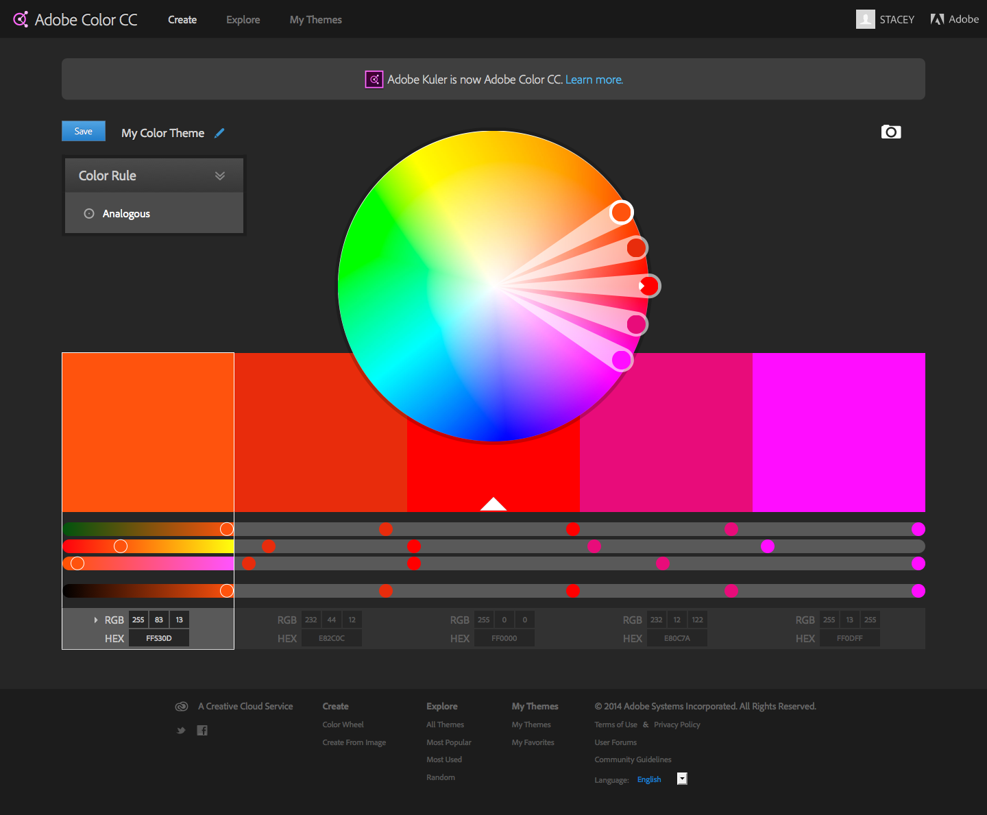
Second, I found Adobe Colors to be a breath of fresh air. It is formerly known as Adobe Kulers. If you have tried Kulers before and not liked it, you should give it another try. If you tried it and liked it, then you should still give Colors a try as it is new and refreshed. To me, I felt that Kulers was clunky. It left me wanting something easier to use. Then came Colors.
What intrigued me most about Colors is that it had so many options to adjust the colors. I was in heaven. Not only could I adjust one color, but I could adjust each color independently. That was pretty sweet. Not only could I customize my colors on my own, but I could change the color palette based on basic color rules – analogous colors, triad colors, monochromatic, etc. It adjusted all 5 colors on the palette appropriately. Even upon doing this, I could then turn around and adjust the newly created palette. It was still fully flexible.
My favorite option, however, was when I realized that I could upload an image and it would pull a palette from an image. It would still give me the same options from the palette it would pull from the image as well. That was a done deal. I could quickly and easily pull multiple color palettes from a variety of images and not spend hours picking colors and hope they all go together in the same palette. No longer did I need to spend hours picking colors. The tedious work was now done! I was actually way happier than I probably should have been at that moment.
You can save and share your palettes, but this requires registration as well. Unfortunately, this probably requires a Creative Cloud membership but I cannot confirm this 100%. I am a CC member so that is what I know and it just works for me. If someone wants to verify that for me, I would appreciate that.
The color palette blocks while not as large as they were on Coolors, they are still very large which is a nice bonus in my mind. Once you save the palette, they are those tiny squares but once you click on the palette and go back into the larger view you have your large color blocks again. To me it just makes sense to have large blocks of color because it is easier to see the colors.
Verdict
Which one is better? I do not think that there is one that is better than the other at this point. I think both are viable options for color selection. I even know that I would still create my own little color cards for clients to view specific to their project. I just wanted to present these options to others that may be searching for options.


